The Pudding’s latest data visualization is a killer example of how to debunk myths using empathy and data
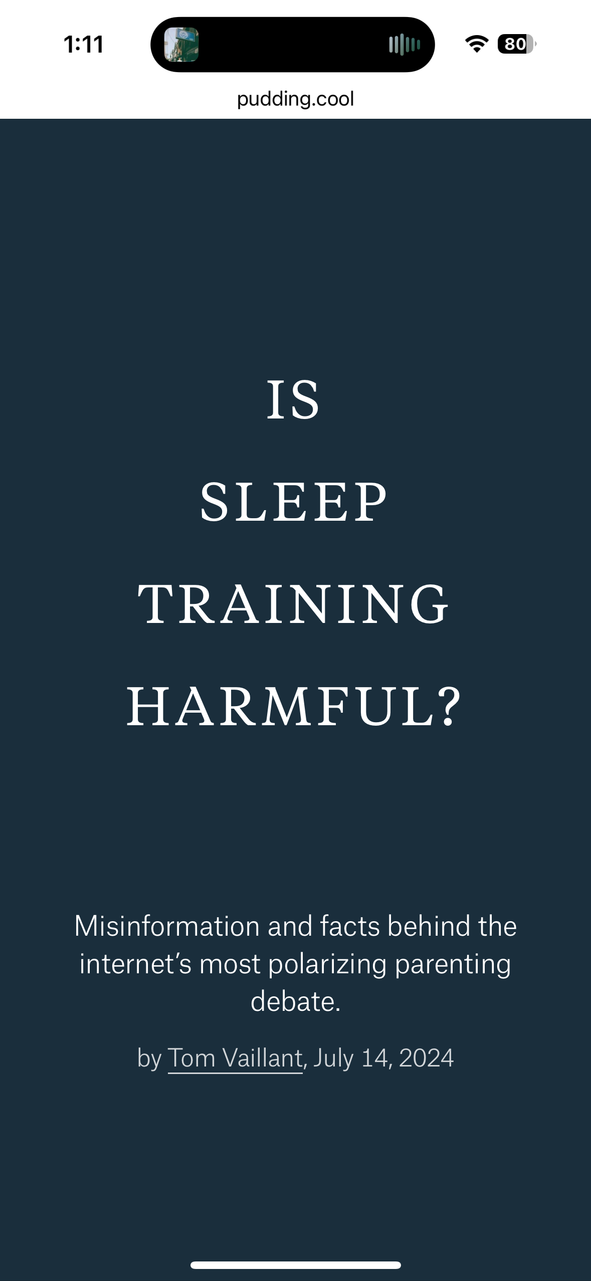
On Friday, The Pudding published a piece about ‘sleep training’. Pretty much any parent can relate to the anxiety and lack of definitive answers that come with a newborn. There isn’t a lot of science on any issue (formula! diapers! daycare!), and feeling lost leads to Google searches (or Facebook groups), and those lead to nothing good, ever.
Tom Vaillant does the homework on this one with a killer visualization across media, including Instagram, Reddit, mainstream media, parenting books, and scientific articles.
What I love about this piece is that he approaches it like a bit of a naif: there doesn’t seem to be any expectation at the outset – every source is given consideration and weight. Eventually, the science wins out, and Vaillant shifts into Mythbusters mode at the end, trying to figure out where the misunderstandings and misinformation come from.
It’s convincing and compelling reading. The Pudding seems to have taken the Vox model to new heights, using data and awesome visualization functions.


